 |  |
 Free JavaScript Editor
Perl Manuals
Tk Interface Extension (Tix) widgets are an additional set of widgets that come with the Tk module.
In this chapter, we cover the widgets from Ioi Lam's Tix 4.1.0 package. TList, HList, Tree, and DirTree are container-style widgets, designed to hold display items. This chapter covers:
You'd use the TList widget in place of a a ListBox when you want to display something other than text or want to display individual items in different fonts or colors. HList gives you the ability to structure a list hierarchically or with elegant column headings. The Tree widget provides a simpler interface for creating an HList with indicators, and DirTree is further simplified for displaying a filesystem hierarchy.
Before we talk about the widgets individually, we need to give you some background on how display items work and how to configure them. Once that's established, we can discuss the Tix widgets in detail.
One of the things we gain when using Tix widgets is the ability to create a display item and then add it to a Tix widget for display. Display items are all rectangular, and the container widget manipulates those rectangles with little regard to anything other than the size of the rectangles and the order in which to display them.
There are four different types of items you can use in Tix widgets: text, imagetext, image, and window. A text item displays only text. An imagetext item can display both an image and text, or only an image, or only text. An image item displays only an image, and a window is another widget.
When creating each item in our TList, we specify the type using the -itemtype option:
$tl = $mw->TList->pack(-expand => 1, -fill => 'both');
foreach my $i (0..19) {
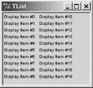
  $tl->insert('end', -itemtype => 'text', -text => "Display Item #$i");
}
In Figure 18-1, we see there are 20 different display items inserted. Each has an item type of 'text'.

Now let's change our example to show different item types:
$tl = $mw->TList->pack(-expand => 1, -fill => 'both');
my $image = $mw->Getimage('folder');

foreach my $i (0..4) {
  $tl->insert('end', -itemtype => 'text', -text => "text Item #$i");
  $tl->insert('end', -itemtype => 'imagetext',
              -text => "imagetext item #$i", -image => $image);
  my $b = $tl->Button(-text => "Window item #$i",
                      -command => sub { print "Button pressed\n"; });
  $tl->insert('end', -itemtype => 'window', -widget => $b);
}
Figure 18-2 shows our screenshot, generated using the previous code, then manually resized to make it pretty with three items per column.

We didn't bother showing the 'image' type in this example, since it's just an image with no text on it. The fonts and colors used to display each item are the defaults for the TList widget, but we could change them on a per item basis using item styles (covered in the next section).
Table 18-1 lists the options you can use when creating each of the display item types. Different widgets use different methods to create item types. In our previous examples, we used TList, so the method to create a new item is insert. If we were using the HList widget, we would call itemCreate to create a new item.
|
Option |
Text |
Imagetext |
Image |
Window |
|---|---|---|---|---|
|
|
|
||
|
|
|
||
|
|
|||
|
|
|||
|
|
|
|
|
|
|
|
||
|
|
|
||
|
|
|||
|
|
 JavaScript Formatter
Perl Manuals