 Debugger script
Dhtml css
A radio button control is a circular button that is blank when unselected, but filled when selected. You can select only one radio button in a list at a time. You might be wondering why this control is called a radio button. Actually, the name comes from the radio buttons found on old car radios, which let you select a radio station by pressing a button, and then select another station by pressing another radio button (which popped up the previously pressed button). Radio buttons in forms work the same way. Selecting a button will unselect the previously selected button, in other words.
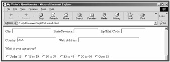
Enter the following code to create a radio button list that lets visitors select their own age group (see Figure 7.4):
<p>What is your age group?</p> <p><input type="radio" name="Age" value="Under-13">Under 13   <input type="radio" name="Age" value="13-19">13 to 19   <input type="radio" name="Age" value="20-34">20 to 34   <input type="radio" name="Age" value="35-49">35 to 49   <input type="radio" name="Age" value="50-64">50 to 64   <input type="radio" name="Age" value="Over-65">Over 65</p> </form>

In this case, the type="radio" attribute specifies that the input control is a radio button. Unlike with text box controls, the same NAME attribute value ("Age") is assigned to all radio button controls within the same group of radio buttons. The VALUE attribute specifies the second part of the name/value pair that is sent when the form data is submitted. For example, if the "20 to 29" radio button is selected, the name/value pair of Age/20–29 will be submitted with the form data.
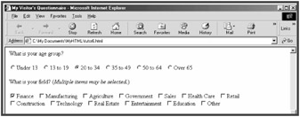
You can specify that a radio button should be selected initially by including a CHECKED attribute in the INPUT element. The CHECKED attribute is a standalone attribute that doesn't take a value. Specify that the "20 to 34" radio button should be initially selected (see Figure 7.5):
<input type="radio" name="Age_Group" value="20-34" checked>20 to 34  
Check boxes work in a fashion that is similar to radio buttons, except that they are displayed as square boxes (instead of as round buttons) and visitors can select as many as they want. Enter the following code to create a list of check boxes that lets visitors select their field (see Figure 7.6):
<p>What is your field? (<i>Multiple items may be selected.</i>)</p> <p><input type="checkbox" name="Field" value="Fin" checked>Finance   <input type="checkbox" name="Field" value="Manu"> Manufacturing   <input type="checkbox" name="Field" value="Agri"> Agriculture   <input type="checkbox" name="Field" value="Govt"> Government   <input type="checkbox" name="Field" value="Sale"> Sales   <input type="checkbox" name="Field" value="Heal">Health Care   <input type="checkbox" name="Field" value="Retl">Retail<br> <input type="checkbox" name="Field" value="Cons"> Construction   <input type="checkbox" name="Field" value="Tech"> Technology   <input type="checkbox" name="Field" value="Real">Real Estate   <input type="checkbox" name="Field" value="Entr"> Entertainment   <input type="checkbox" name="Field" value="Educ"> Education   <input type="checkbox" name="Field" value="Othr"> Other  </p> </form>

In this case, the type="checkbox" attribute specifies that the input control is a check box. Other than that, check boxes are created the same way as radio buttons. Notice that a CHECKED attribute is included in the first check box's INPUT element, which causes it to be initially checked.
Besides text boxes, radio buttons, and check boxes, there are a number of additional input controls that you can create with the INPUT tag. Of these, the most important are the submit, reset, and image controls, which are used to submit form data or reset the form. I cover these later in this session.
There are two other input controls that you might use: hidden and password controls. A hidden control allows you to include a control that submits data, but which will be hidden from the user. Form processing CGI scripts also may require that you specify one or more hidden controls to help direct where your form responses should be sent or specify the address of your confirmation page. A hidden control is specified by a type="hidden" attribute.
FIND IT ONLINE
A password control works like a text box control, except the typed text is displayed as a series of asterisks. A password control is normally used in conjunction with an application (created using CGI or JavaScript), which does not allow a visitor to access a page or folder if they do not know the correct password. A password control is specified by a type="password" attribute. For a selection of password-protection JavaScript scripts that you can cut and paste into your page, see javascript.internet.com/passwords/.
 Debugger script
Dhtml css