 Javascript validator
Website design
HTML pages often utilize form elements for user input. These elements include basic tools for user input. These form elements are not useful in plain HTML. Although they are rather easy to put on a page, they don't do much unless there is some kind of program attached. Much of what you do as a PHP author will involve getting information from Web-based forms, so it's important to be familiar with the most common form elements. You'll start to write programs that retrieve values from forms in the very next chapter, so it'll be good to learn how they work.
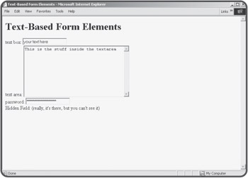
Most of the form elements are really about getting some sort of text information from the user to a program. The first set of such elements are those that simply allow the user to enter some kind of text. There are four such elements, illustrated in Figure 1.9.

The code used to generate textForm.html is reproduced here:
<html>
<head>
<title>Text-Based Form Elements</title>
</head>
<body>
<h1>Text-Based Form Elements</h1>

<form>

text box:
<input type = "text"
       name = "txtInput"
       value = "your text here">
<br>

text area:
<textarea name = "txtBigInput"
          rows = 10
          cols = 40>
This is the stuff inside the textarea
</textarea>
<br>

password:
<input type = "password"
       name = "secret"
       value = "you can't read this">
<br>

Hidden Field: (really, it's there, but you can't see it)
<input type = "hidden"
       name = "mystery"
       value = "secret formula">

</form>
</body>
</html>
All the elements that will allow user interaction are placed inside a <form></form> pair. The most common form element is the <input> element, which comes in several flavors, designated by the type attribute.
The most common input element of all is the humble text box. To make a plain vanilla text box, I used the following code:
<input type = "text"
       name = "txtInput"
       value = "your text here">
The element is a basic input element. By setting the type to "text", I'm signifying how the element is to be displayed on the screen— as something that the user can type text into. An input element using the text type is usually called a text box. Text boxes cannot include multiple lines of text, but you can specify the length of the text box with the size attribute. (If you set the size to 20, you are allowing for roughly 20 characters.) It is important to add a name attribute to your text boxes (and indeed to all form elements) because later you are going to be writing programs that try to retrieve information from the form. These programs will use the various form element names to refer to what the user typed in.
| TRICK |
Naming an input element is something of an art form. The name should be reasonably descriptive (r or albert are usually not good input object names, because they don't explain what kind of information is expected to be in the object). Object names should not have spaces in them, because this will cause confusion later. You'll learn more about this in the next chapter when you begin working with variables, which have a very close relationship to form elements in PHP. |
The value attribute is used to set a default value for the text area. This is the value that will appear in the text area when the user first sees your form. It's a good idea to put default values in forms when you can, because this gives you a chance to show the user what kind of information you're expecting.
Text boxes are very handy, but sometimes you will want to let the user type in more than one line's worth of information. For example, you might want to have a feedback page where the user can type in some comments to be e-mailed back to you. For this kind of situation, you will usually want to use an object called the text area. The code to create such an element looks like this:
<textarea name = "txtBigInput"
          rows = 10
          cols = 40>
This is the stuff inside the textarea
</textarea>
The text area is created using a pair of <textarea></textarea> tags. The text area has a name attribute, as well as attributes for determining the size of the text box in rows and columns. Text areas should also be named using the name attribute, but the textarea object does not have a value attribute. Instead, anything between the <textarea> and </textarea> tags is considered the contents of the text area object.
| HINT |
Don't forget to close the textarea with a </textarea> tag. If you don't, everything in the page after the <textarea> tag will appear inside the text area if the page renders at all! |
Password fields are almost identical to text boxes. The code for creating a password is very much like the text field:
<input type = "password"
       name = "secret"
       value = "you can't read this">
The only real difference between the password field and the text box is that the value typed into a password field is shown as asterisks on the screen. Presumably this will keep the KGB from peering over the shoulders of your users while they type passwords into your pages.
| TRAP |
It's critical to note that the password field offers virtually no real security. As you will learn in the next chapter, the information that is sent to the server via a password field is transmitted entirely in the clear, so it is only nominally secret. |
Believe it or not, the text box has an even more secretive cousin than the password field. The hidden field is much like the text box in code, but it doesn't appear on the page at all. Here's how the code looks:
<input type = "hidden"
       name = "mystery"
       value = "secret formula">
The uses for such a field that are hidden from the user might not be obvious now, but it does come in handy when you want your page to communicate with a serverside program but you don't need the user to know all the details. (I'll show you an example soon, I promise.)
It's very easy to add text elements to your Web pages, but requiring users to enter text can interrupt the flow of the program. Whenever possible, experienced programmers like to give the user choices that do not involve typing. HTML forms have a number of simple elements for allowing the user to choose from a list of options using the mouse.
| TRICK |
Making the user's life easy is a good reason to use some of these other input features, but there's another reason. You never know what a user will enter into a text box. It can be very difficult to write code that anticipates all the possible wrong things a user can type in. If you use the various selection elements described below, you pre-determine all possible values your program will need to deal with (at least in most circumstances). |
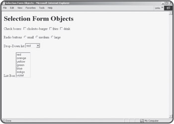
Figure 1.10 shows a number of these selection-style elements on a Web page.

The first type of input to consider is the checkbox. Checkboxes usually look like, well, boxes that can be checked. Usually there is some kind of text near the checkbox.
The box can be checked or not checked. Here's the code used to create the checkboxes in the selectForm.html page:
<input type = "checkbox"
       name = "chkBurger">cholesto-burger
<input type = "checkbox"
       name = "chkFries">fries
<input type = "checkbox"
       name = "chkDrink">drink
A checkbox is simply an input element of type checkbox. Although you can specify the value attribute of a checkbox, it isn't usually necessary as it is with other input elements. Note that the caption next to the checkbox is plain html text. Each checkbox is a completely independent entity. Even though several checkboxes appear together in the HTML document, the value of one checkbox has no bearing on the value of any other checkboxes.
Checkboxes are appropriate when any combination of the various elements is appropriate. For example, the user might want the burger, fries, and a drink. The user might want none of these things, or any combination. Checkboxes are not as appropriate when the options are mutually exclusive. For example, if asking what size a drink should be, only one size should be allowed per drink. That kind of situation is a perfect place to use another feature called radio buttons.
You can use radio buttons (sometimes called option buttons) to let the user choose an item from several options. Radio buttons get their name from the radios on cars (at least when I was a kid) that had several buttons sticking out. To select a station, you pressed the corresponding button in, which caused all the other buttons to pop out. HTML radio buttons have similar behavior. Radio buttons are grouped so that when you select one button, all the others in the group are automatically deselected.
Look at the code for the radio buttons, and see if you can spot how the radio elements are grouped.
<input type = "radio"
       name = "size"
       value = "small">small
<input type = "radio"
       name = "size"
       value = "medium">medium
<input type = "radio"
       name = "size"
       value = "large">large
The interesting thing about radio buttons is the way they are named. There are three radio buttons, but they all have the same name. This little trick groups the radio buttons so they act as expected. As soon as the user selects one item in a radio group, all other radio elements on the page with the same name are automatically selected. Each of the radio objects has a distinct value. Your programs will be able to determine the value of whichever radio button in the group was selected.
Another common user interface trick is to use some kind of drop-down list. These devices allow the user to choose from a list of options, but the various options only appear when the user is choosing from the list. This is especially useful when screen real estate is an issue or you want to keep the interface clean. Drop-down lists are made with two different elements. The main object is the select object. It contains a series of option objects. (This is analogous to the way li objects appear inside a ul or ol object.) The code for building a drop-down list box will make it all clear.
<select name = "selColor">
  <option value = "red">red</option>
  <option value = "orange">orange</option>
  <option value = "yellow">yellow</option>
  <option value = "green">green</option>
  <option value = "blue">blue</option>
  <option value = "indigo">indigo</option>
  <option value = "violet">violet</option>
</select>
The select object has a name attribute. Each option has its own value attribute. Your program will use the value attribute of whichever element is returned. The value property of an option button doesn't display anywhere. Place the text you want to have visible on the page between the <option> and </option> tags.
One more selection element can be useful in certain situations. This isn't really a new object at all, but a variation of the drop-down list. The code for the last element in selectForm.html is shown below:
<select name = "lstColor"
        size = 7
        multiple>
  <option value = "red">red</option>
  <option value = "orange">orange</option>
  <option value = "yellow">yellow</option>
  <option value = "green">green</option>
  <option value = "blue">blue</option>
  <option value = "indigo">indigo</option>
  <option value = "violet">violet</option>
</select>
The code looks identical to the previous (drop-down) list except for a few differences in the select tag itself. By setting the size attribute to a value of 7, I indicated that seven lines of the list should be shown at any time. This is useful when you want the user to be able to see all (or many) of the choices all the time. The other interesting thing about this type of list box is it can allow for multiple selections if the multiple attribute is included. A multi-selection list box lets the user choose more than one element using standard multiple selection rules (for example, Shift+Click to select a range of contiguous options or Ctrl+Click to add or remove a particular element from the range of selections).
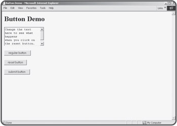
The last major form element is the button. Buttons are important because the user is accustomed to clicking on them to make things happen. Your programs will take advantage of this conditioning. Figure 1.11 shows a page containing three distinct buttons.

All three button types are variants of the basic input tag you've used so much in this chapter. The code for the buttonForm.html page illustrates this clearly:
<html>
<head>
<title>Button Demo</title>
</head>
<body>
<h1>Button Demo</h1>
<form>
<textarea rows = 5>
Change the text here to see what happens
when you click on the reset button.
</textarea>
<br><br>

<input type = "button"
       value = "regular button">

<br><br>
<input type = "reset"
       value = "reset button">
<br><br>

<input type = "submit"
       value = "submit button">
<br><br>


</form>

</body>
</html>
The three different types of buttons look the same but behave differently. When you set the type attribute of an input element to button, you are creating a generic button. These buttons are frequently used in client-side programming. To make something happen when the user clicks on such a button, you'll need to embed code in your Web page using a language such as JavaScript or VBScript. (Of course, there are exceptional books in the Absolute Beginners' series describing exactly how to do this.) Server-side programming (which is the focus of this book) rarely involves the ordinary button object.
The reset button is used to let the user reset the page to its default condition. This is a handy feature to add to a program, because it lets the user back up if the page got messed up. It isn't necessary to write any code for the reset button, because the browser automatically handles the resetting behavior.
The Submit button style is by far the most important kind of button for server-side programming that we will do in this book. The Submit button provides the link between Web pages and your programs. Most interactions in server-side programming involve sending an HTML page with a form to the user. When the user has finished making selections and typing values into the various form elements, he or she presses the Submit button, which essentially bundles up all the data in the form elements and sends them to a program. In the next chapter, you'll learn how to make this actually work, but for now it's important to know how to add a Submit button to your forms, because many pages will use this type of element.
 Javascript validator
Website design